Letterboxd

Letterboxd is a social platform for film lovers to log, rate, review and share what they watch.

The challenge

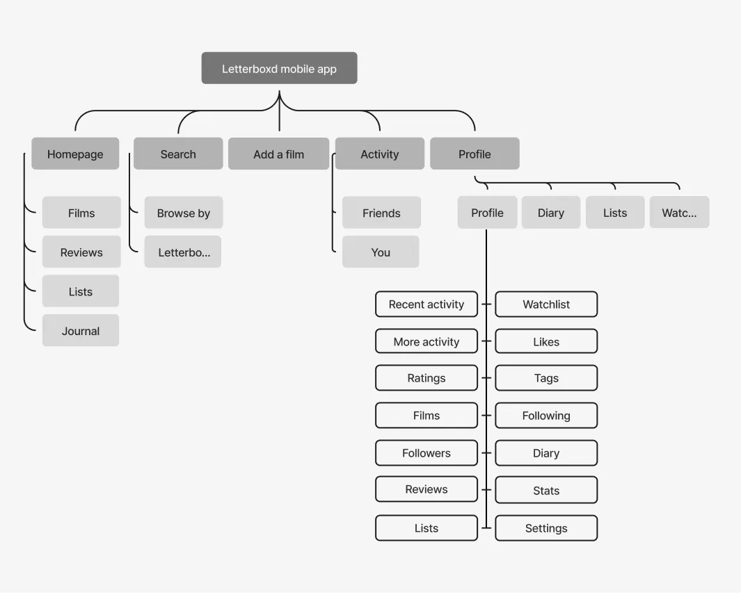
This concept explores why the mobile app frustrates people: little interaction between members, recurring App Store complaints about the interface and a navigation that confuses newcomers.

The outcome

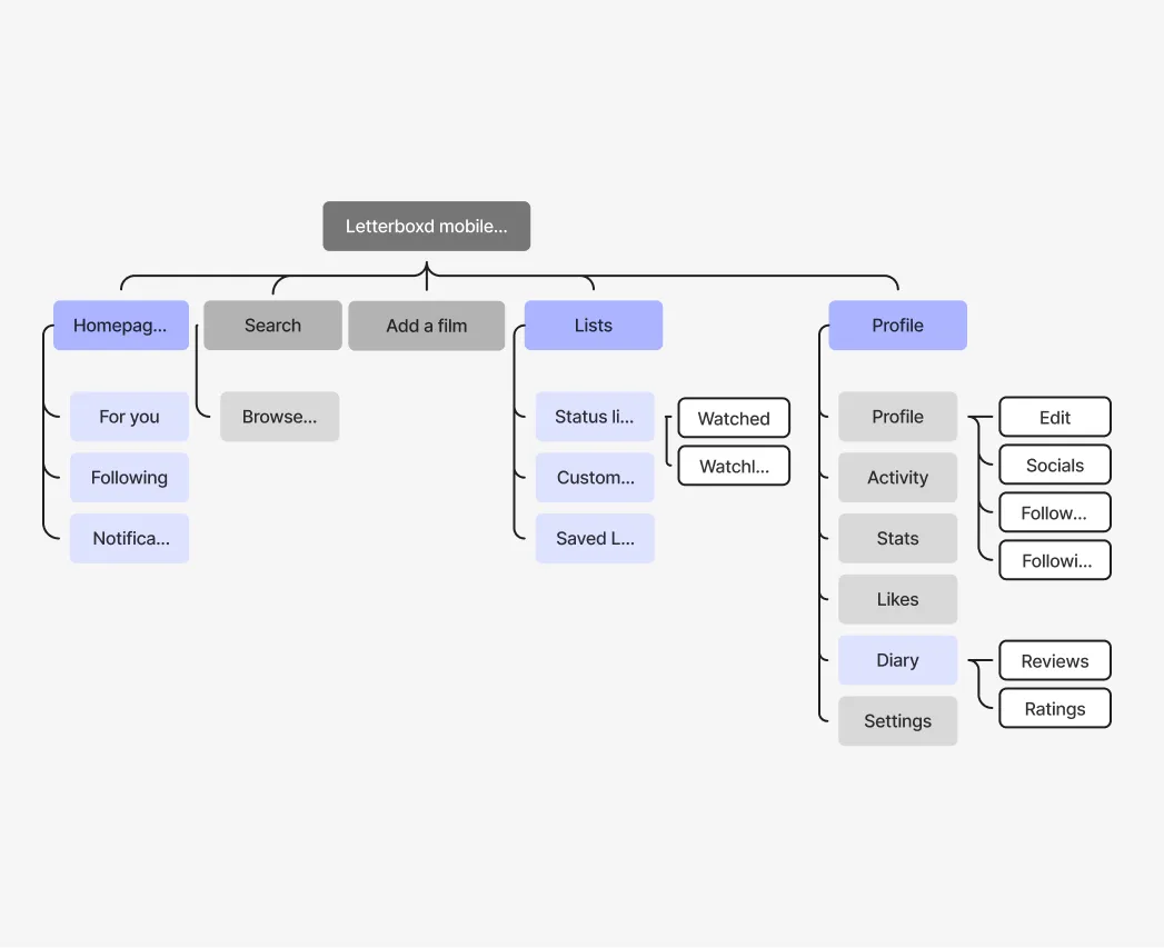
I analysed App Store reviews and the Letterboxd suggestions portal, then, guided by usability heuristics, simplified the sitemap. Activity and Journal became a “For You” feed next to a new “Following” tab, and all lists moved into one place. I redesigned the interface with fewer elements per screen and clearer hierarchy, keeping its cinematic feel.

Role
Product designer
Type
Unsolicited concept
Deliverables
Research, IA, wireframes, mobile UI
Timeline
2 weeks, 2024
Letterboxd app redesign on a phone resting on a table, showing the home feed
Four screens of the current Letterboxd app
1The current app: dense screens, repeated content and unclear navigation for new users
Sitemap of the current app
2Before: Repeated content and a cluttered structure
Sitemap of the redesigned app, with changes highlighted
3After: Activity and Journal merged into For You, a new Following tab and a single Lists page
Four grey mid-fidelity wireframes of the main screens
4Mid-fidelity wireframes: less information per screen, clearer hierarchy and grouping
Two redesigned screens: the lists page and a watchlist
5Lists: everything organised in one place, with sorting and filtering inside each list
Phone on a dark fabric surface showing the redesigned home feed
6Home: one stream for people you follow, one for discovery
Two redesigned profile screens with favourite films and recent activity
7Profile: reviews, ratings and watch history in one place.
Phone on concrete showing the redesigned watchlist with film posters
← Back to works